Saturday 30 November 2013

Album cover photography

A few weeks back whilst shooting the narrative for the music video we found an old TV outside in a back lane, we then went to the front door and asked if we could have it, the man said yes so then we took it back to Tilda's house where it has been sitting for weeks waiting to be smashed up.

The idea is that the album has a theme of loss of signal/ telecommunication error of which we will name our album 'Antennae' this gives it the retro old school indie theme that is conventional but allows us to be very creative and arty as well.

Today we wanted photos of the TV screen smashed through and and for it to be lying in a back lane, we thought this would be a good idea because it is rebellious and eccentric just like indie rock fans want to see. The screen smashing to allot of effort to get it to crack in the way we imagined but we are pleased with the results.
Tilda smashing the TV with a hammer
Photographing the TV
Tea Break!

We imagined the cover to be a close up shot of the smashed screen with little background boarding the image, we took various other shot types too just in case for whatever reason we change our minds later on. We took a wide shot with blank wall space on the left and/or right sides for example if we decided to use it for the back cover where the list of song titles go. We also took some photos with a Doc marten as if it's kicking the screen inspired by the hand smashing egg idea on the Yeah Yeah Yeah's cover for 'It's a Blitz'


Friday 29 November 2013

Colour Bars

Today we begun to make the coloured signal bars that we will use as a filter over the band image for the inside cover of the digipak. First we tried out microsoft publisher but this proved difficult and not efficient for what we wanted, also when we wanted to transfer it into photoshop this proved difficult as it didn't recognize the file type. We then tried on Adobe InDesign which proved allot more efficient since we all knew how to use it from year 12 work. To align the boxes evenly we used the guides quite allot for the boxes to snap themselves into place, also this program was good because it gives you signal to tell you when you are drawing a box of an even width as the other.


Once we had our filter we opened it into photoshop and placed it on a higher layer to the band photo we'd previously edited, we changed the opacity to 60% for the right effect to produce the image bellow.


Creating the coloured bars on InDesign

To create the coloured signal bars to use as a filter over a band image I made these on Adobe InDesign. Firstly I opened up the program and went new document>paper size: A4>Ok

Next I clicked the rectangle frame tool at the left side toolbar...


...and drew my first rectangle frame onto the page, I copied and pasted this a few times to get the right amount I needed using the black selection tool to select boxes and move them around.


To line my boxes up equally I moved one of the  boxes slightly closer to the one I wanted to align it with and waited for the arrows to appear at either end to tell me they are equal. I also used guide lines by dragging down/across from the rulers.

Next to change each bar to the correct colour I clicked on the Fill tool to select my colour then the apply colour tool afterwards to use it.


Once I finished the colour bar effect I saved it as an Indesign file because that way the background would remain transparent as this file type is supported in Photoshop where I will be superimposing it over my band image.


Thursday 28 November 2013

Band Image Photoshopping

Today we photoshopped an image that will appear on the inside left cover of the digipak with a colour signal bar filter over the top afterwards. First we got rid of the bands spots by using the clone and airbrush tools close up on their skin, we then used the healing tool to smooth the gradient screen in the background. We were originally going to completely cut the band out but we decided against it because the shadows would have disappeared and the image would look very fake and flat. We then changed the brightness and contrast to get the boldest effect we could so it would definitely stand out against the bright filter we will pout on top. Bellow is the finished image ready for the filter:


Deluxe Edition editing

In order to make it obvious to our target audience that they are obviously buying a deluxe edition digipak I looked at Lana Del Rey's Born to Die albums to see the contrast and what I should include on ours.

Lana Del Rey- Born to Die: Paradise Edition vs. Original

Here the deluxe font is a metallic gold and the background much more rich looking as the original is a plain blue sky. Also a different image of the indie singer is used but in the same pose so there is a direct link between the two versions. 'The Paradise Edition' font is cursive and clearly stands out from the text on the cover.

On our own album we have decided to make all the deluxe features a lime green so it will stand out over the other text. We will also use an obscure image of the lead singer that would most likely not be used on the original released album it would most likely be of the full band but here analyzing these two albums it is clearly conventional.

Wednesday 27 November 2013

More images from the shoot (unedited)


Final Band Shoot

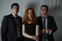
Today we planned to re-shoot the full band as everyone was now informed on the costume decisions for the whole band image. We had a lesson just before lunch so us 4 set up the studio once more but this time with different lights. It had been suggested that for the dramatic slow lit image we wanted to achieve that we should use a specially positioned backlight. We also had the opportunity to use the better photography lights with the light diffuser panels to give a smoother look. We positioned the backlight (1) on the back left next to the screen and the light with a diffuser panel (2) in the top left corner of the area. We placed the tripod (3) with the camera in the front center of out set up and we took turns to hold the reflector (4) to the right of our band.


We used the reflector to bounce the light onto Tom's face because we positioned the band in a triangular stance with Tilda in the middle Tom was in darkness because of the lighting only coming from one side and this piece of equipment was a way around this.

Tom and the reflector
Backlight
Difuser panel

Bev being a happy photographer!


Tuesday 26 November 2013

Today's band photoshoot

Today we all finished early so we decided to use the extra time for a band photoshoot that will go on our digipak. We set up the white screen backdrop in the media room and adjusted its height by the leavers on the tripod style stands on either side. We set up two studio lights on either side of the screen and set the camera with the tripod up in the center.

We had a slight mishap with the costume as one of the band members was misinformed about the smart monochrome dress we had decided on, there was not enough time tonight to run home and change so we decided on a reshoot tomorrow lunch to make up for it. Despite this, we didn't waste the time we had so we took individual profile photos of the two remaining band members who were dressed for possible photo set edits we could use if we decide to do a foldy out booklet.

As inspiration for these band shots, we used a few black and white images of the XX where the shadow was quite dramatic making the photos look more dynamic. To replicate this effect we turned off one of the studio lights and used reflector boards to aim the light underneath the band members faces to get the dramatic indie look we wanted. The we played about with the aperture of the camera to make sure just the right amount of light got into the camera without it looking over/under exposed but still having a dramatic shading effect. Overall I would say today was still a successful shoot!


The Lights we used


Saturday 23 November 2013

Initial Hand Drawn Designs of Adverts


 Hand Drawn Design 1

This is an image of an old retro TV with white noise against a brick wall with an emerging face of the lead singer appearing faintly. The face appears mysterious which is what we want for our band image because it provides more interest from the fans as they will want to know more about them and therefore more likely to buy into them. The block font was inspired by that of Foals- Holy Fire Advert as it stands out dominantly over the background attracting the audience. The urban brick wall idea is a conventional indie feature used in Palma Violets- 180 Advert which will help attract an indie audience. At the bottom the 'Includes- Antennae-Dull Life-Souls' idea is inspired by Mumford and Sons- Sign No More Advert which will encourage sales when indie fans recognize a favored by our band that they may have heard of. The large release date is also conventional of Indie Adverts as is used on the Gorillaz- Plastic Beach Advert this then stands out to the indie audience as an important feature which it is. The 'Deluxe Edition' text and the release date are written in a bright standing out green to catch the readers eye, this idea of the deluxe information on the advert being significantly different from the other information is a convention often followed in indie adverts.

Hand Drawn Design 2

This is an image of a retro smashed up tv obscurely plugged into a brick wall, this mysterious absurdity is inspired by that of the album cover for Muse- Black Holes and Revelations this element of mystery is what we want to portray our band with. The thumbnail of the album cover wit h a drop shadow as well as the 'available on itunes' text are both very conventional of Indie digipak adverts. Again, the urban brick wall idea is a conventional indie feature used in Palma Violets- 180 Advert which will help attract an indie audience. The bold 'FAUX' font is in capitals and bold like on Foals- Holy Fire Advert the use of contrasting white to the black background also follows a similar idea to the Foals ad. The large release date is also conventional of Indie Adverts as is used on the Gorillaz- Plastic Beach Advert this then stands out to the indie audience. The 'Deluxe Edition' text and the release date are written in a bright standing out green to catch the readers eye, this idea of the deluxe information on the advert being significantly different from the other information is a convention often followed in indie adverts. The website link on the right side helps contract a young indie audience as, people of this age range we are targeting (teens-20's) are known for being frequent internet users.

Hand drawn design 3

Here shows a three shot of our band in black and white with a retro coloured signal bar filter superimposed over their upper bodies. The large release date is also conventional of Indie Adverts as is used on the Gorillaz- Plastic Beach Advert this then stands out to the indie audience. This gives the band a slight mystery as they are partly hidden which is how we want our indie band to appear to our target audience like the likes of The XX or Peace. The high contrast black and white main image is inspired by the Palma Violets- 180 Advert as this is a very dramatic, artistic image that will appear to indie fans. The 'Deluxe Edition' text and the release date are written in a bright standing out green to catch the readers eye, this idea of the deluxe information on the advert being significantly different from the other information is a convention often followed in indie adverts. The bold white 'FAUX' font stands out against the background which is a technique used in the Gorillaz- Plastic Beach Advert and Mumford and Sons- Sign No More Advert. This gives the band name authority helping with the branding side of things. The initial idea of superimposition was inspired by the cover of the Submarine film soundtrack Digipak which includes indie music from Arctic Monkeys singer Alex Turner so I thought this inspiration was still conventional. This artistic nature of the image is one very appreciated by indie fans. The website link on the right side helps contract a young indie audience as, people of this age range we are targeting (teens-20's) are known for being frequent internet users. Also the 'CD-VINYL-etc.' text at the bottom center of the ad allows the young audience to experience the band in many multimedia forms- the inclusion of the vinyl is also very typically appreciated by indie fans and will encourage them to buy it.

Friday 22 November 2013

Audience Research: Which Advert design they liked best

Today in school we surveyed indie fans asking them which out of the three hand drawn designs they liked best, here are the results:


some of the reasons for choosing design 3 as the most poplar were:

"It is artsy  and retro which is what indie fans want"
"It is colourful and bold which stands out to me"
"The layout and idea of the filter over the band is excellent"
"I like the use of green for special edition"

Initial hand drawn designs of digipaks

From previous research, we decided that the most successful indie digipaks are the ones that have a solid theme running throughout, therefore we have came up with 4 different themes which we will put to our target audience to get feedback.

 Design A

This design is influenced by the animal theme of the Kings of Leon Previously analysed at the beginning of the project. The disguise idea is a convention often found in the indie rock music genre for example: Marina and the diamonds video- Radioactive and Bastille- Laura Palmer. The horizontal list form of the song titles on the back are conventional of indie albums as is used on  the Kings of Leon album- Only by the Night.


Design B 

The retro theme of this album has been inspired by Amy Winehouse-Back to black as this is often associated with indie fans. The bold 'FAUX' text stands our and dominates the page which is influenced by the Amy Winehouse cover also. On the reverse the text is aligned left which is conventional of indie rock albums such as Muse- Black Holes and Revelations. The white noise as well as the tv test card disk and the colour bars on the inside cover all link together to the indie retro theme that fans stereotypically love. Legalese such as the copyright info, barcode and production logos all appear on the back as essential conventions of digipaks.


Design C

This design was heavily influenced by that of Flobots- Survival Story album which shows a deserted polluted landscape. Therefore this digipak will portray our band as environmentally concerned and slight hippy which is closely liked with the indie music genre so will appeal to most indie fans. The large CD & DVD text makes it clear that is is a digipak similar to that of the Flobots album again. On the reverse, the track listings are horizontally lined up inspired again by the Kings of Leon album- Only by the Night.  Legalese such as the copyright info, barcode and production logos all appear on the back as essential conventions of digipaks. The lime green against the black and white imagery will make this album stand out dramatically and this contrast of colour is used in a slightly different way (but still inspired) by Amy Winehouse-Back to black (but her's used simple black and white). The toxic waste on the disk provides a novelty artistic effect which is conventional and will appeal to the indie audience, this is inspired by the planet on the Muse- Black Holes and Revelations disk.

Reverse of Flobots CD