Sunday 15 December 2013

Evaluation

The idea behind our evaluation is a behind-the-scenes film Documenting the making of the Dull Life music video. Artists such as Kesha and Katy Perry have done this previously and we like how much of an insight the audience can gain from watching a program such as this. We are splitting the responsibility between the four of us, each writing scripts and planning what each question will include:

Question 1 - Bev 
Question 2 - Reece
Question 3 - Tilda
Question 4 - Tom

The documentary will include face to face and radio interviews with Tilda, a 60 seconds news program announcing the bands success and a conference call between the manager and the editor as well as inserts of Tilda recording herself inbetween shoots. The documentary itself will have a lot of visual things such as inserts from the music video, photos of editing processes and clips from the videos that influenced us.


Thursday 12 December 2013

Evaluation filming


Today we began filming question 1 of the evaluation. Question 1 is largely going to be answered through an interview with Tilda, the lead singer of Faux, and Reece who will be playing the part of the editor of NME Magazine. We want the interview to look as professional and realistic as possible which is why we decided to create our own makeshift dressing room. We used Reece's shed as it looks like a log cabin, and filled it with clothes rails, props and furniture to make it look busy and in use.
Here are some photos from tonight's filming.


Tuesday 10 December 2013

Capital FM Studio

As part of question 1, we've decided to host a 'radio interview' to discuss the codes and conventions. As a possible filming location we spent today looking at the Capital FM studio in Silverlink Business Park. We took some photos
Outside

Main Studio

Computer System (Includes Adobe Audition for recording the interview while the sound desk to the right enables us to fade microphones up or down)

Emergency CD (in case we accidently take the station off air)

Creating the Facebook Page

As part of our evaluation we created a Facebook page for our band

We then edited it to make it appear to be a professional media product

Planning the Evaluation

Before we begin to produce our evaluation, we have created a script for our video

Evaluation Time!

Over the next couple of weeks we will be producing the evaluation of our music video and digipack. There are a set number of questions that we must answer and it is requirement that the video must be under 20 minutes long while answering the questions thoroughly.

Friday 6 December 2013

Feedback On Our Final Media Products

Here are the results we collected from our digipack survey


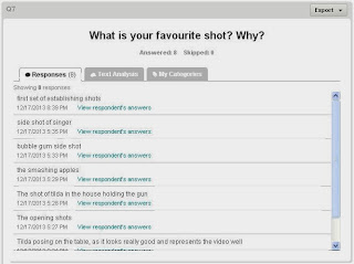
Here are the results we collected from the video survey:


Thursday 5 December 2013

Creating the Surveys For Our Final 3 Media Products

Finally, it was time to get audience feedback based on our three final products: the advert, the CD and the video itself. We used Survey Monkey for the last time to create the 2 surveys, one for the digipack (advert/CD), and one for the video. To allow us to send the surveys out with ease, we used Tinyurl to enable us to create short memorable links.


Here, we shortened:
https://www.surveymonkey.com/s/9K9JDC8 to http://www.tinyurl.com/rtbtsurvey1

Wednesday 4 December 2013

Final Digipak and Magazine Advert


Negative effect when editing on Photoshop

To follow the chosen theme of the album which is low of signal/technology. We decided to experiment with the album title font 'Antennae' to make it stand out as much as possible. We thought by putting it in negative on photoshop it would tie in our idea more and make it stand out to out target audience.

We did this by clicking Ctrl+I on photoshop to reverse the colours


We experimented between the black and white fonts by making the black font white before inverting and vice versa.

Tuesday 3 December 2013

Indie Song Title Inspiration

Here we did some quick research into indie song titles for the reverse of our digipak:

Indie band The XX songs:

Angels
Chained
Fiction
Try
Reunion
Sunset
Missing
Tides

Indie artist XXYYXX songs:

About You
Good Enough
Fields
Set it Off
Alone
Breeze
Closer

Our findings were that many titles were single words with a maximum of about 3, therefore we kept ours down like this. Also allot of the were very mysterious/artistic/lyrical sounding which is what we wanted to do with ours to portray our band in the same kind of way, here are our song titles:

Faux song titles:

Antennae
Dull Life
Montague
A Tribe
Veins
Home bound
Made to be
Airfields
Gridlock
Berlin

How to make a barcode on Adobe Photoshop

This is how we created our barcode for our digipak so that it was original and our own:

First you click File>New>Ok

Then you click on the single row marquee tool.


Then draw a line with the cursor across the canvas

Then go on to Filer>noise>add noise

This menu should pop up, slide the bar to the full amount, click Gaussian and Monochromatic then Ok


Next select the move tool

This will allow you to stretch the line you have created

Using the middle two points on the line stretch it either way to create your barcode.
Next add numbers using the font tool and alter the font/size/position how you think looks good

Creating the Test Card

In style with the indie idea of signal and interference we created a replica of a BBC Test Card (to be used on the first or second page of the CD). Test Cards were used as a TV test signal during times when the transmitter would be active but no programs were be being broadcast. They would usually feature universal colour bars to allow receivers to be adjusted to show the image correctly.
We created the replica test card based on the BBC's Test Card G used during the 1970/1980s. We created the replica first using Microsoft Publisher to create the shapes. We then imported it as a JPEG image into InDesign where we added the text desired. In this case we added the band name where BBC 2 would have been displayed.We also added the album name.


Monday 2 December 2013

How I edited the glitch image

To create this image first I smoothed out the background with the smooth tool and in parts the clone tool. Next I clicked image>adjust>desaturate.  The to give the image a depth and to make it stand out I altered the brightness on contrast to make it bolder. I then used the airbrush tool and clone tool on a separate duplicate layer to fix any blemishes. Then to get the glitch effect I used the rectangular marquee tool to highlight various sections of the portrait and pressed Ctrl+C then Ctrl+V to copy and paste various sections of the image onto new layers and with the arrow keys I slightly jolted them out of place to give this effect. Once I had played about for a while and was happy, I then needed to make the 3D effect.


To create the 3D effect I duplicated this layer and the right clicked and selected blending options, then under the Advanced blending heading I un-ticked G and B so only R show. Then I duplicated this layer and went into blending options>advanced blending again but this time I ticked R and un-ticked G and B. Next to give the final 3D effect I selected the move tool and clicked on this layer, then I used the arrow keys to move it to the side a few spaces, I did this with the layer underneath and played about for the desired effect and here bellow is my finished product.

Bellow are a few experiments I tried out first before we decided on the above image


Sunday 1 December 2013

Starting to put it together

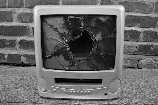
Today we began putting the artwork together on the digipak. We decided against putting the smashed screen on the cover because we were advised to put the best most effective photography here so instead we put the full band shot with the coloured bars. This would be a better idea as it will stand out on the shelf in the shop and grab the target audience's attention. We decided to put the TV on the back with the song titles because we can use one of the photos framed with blank wall space to write on the text. On the inside cover we are still having the test card style graphic that we created on Adobe InDesign on a separate document then converted it to a JPEG.

We also did some font research  on dafont.com and came up with a short list of possibilities:


We decided to put the text in negative as it would contrast perfectly against the different coloured bars that it would be placed across, we did this by highlighting it on Indesign and pasting it into photoshop, we then cropped this as an image file and placed it back into Indesign.

The image of the TV on the back cover is going to be in black and white so that the covers go from B&W to colour in a contrasting pattern with the glitched image of the lead singer on the inside cover contrasting against the test card graphic.

Tomorrow we are planning on putting in the legal information as well as other professional details to make it look like a real digipak.

Digipak photography:smashed tv screen (half edited)

Here are some of the photos we shot for the digipak and/or advert that we have begun to edit:


We have desaturated the filter on photoshop and changed the brightness and contrast of these two images aswell as got rid of the branding on the tv using the clone tool.